一、思路分析
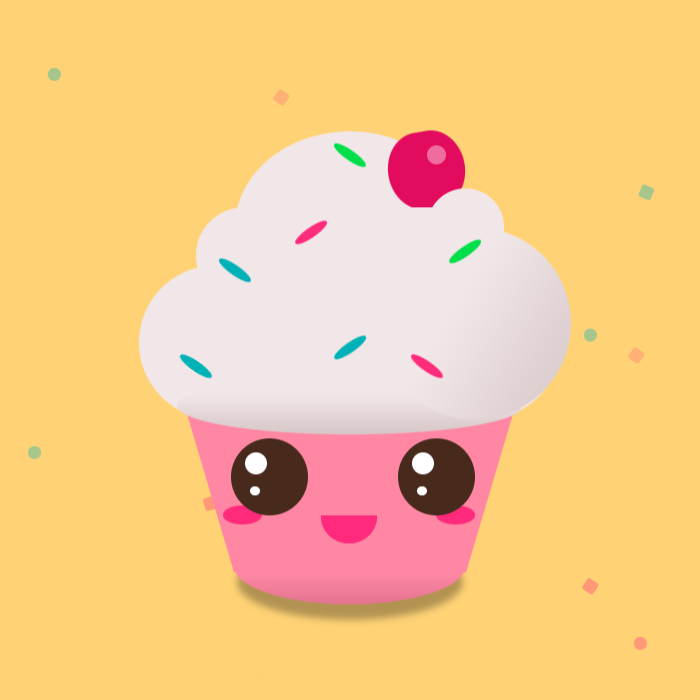
先看效果图,页面功能分成两个部分,一个是冰激凌动画效果,另一个背景碎屑效果。
1)网页采用DOM的方式进行布局。
2)冰淇淋桶可以通过border-radius进行特殊区域圆润处理。
3)眼睛部分,先做个大的border-radius圆角形状,然后内部做小的白色圆角处理,并且进行定位。然后通过animation动画,使眼睛左右移动。
4)嘴角做半圆处理,然后通过rotateZ角度旋转,变为卡通可爱形。以及左右腮红。
5)顶部分三部分处理,以及右上角的樱桃部分。
6)最后是五彩颗粒,我们采用定位的方式,还需要使用一定的圆角处理。
以下是html源码,接下来进行具体分析:
<body>
<div class="particles" id="particles"></div>
<div class="main">
 <div class="cup"></div>
 <div class="shadow"></div>
 <div class="eye eye-l"></div>
 <div class="eye eye-r"></div>
 <div class="blush blush-l"></div>
 <div class="blush blush-r"></div>
 <div class="mouth"></div>
 <div class="top">
  <div class="top_item"></div>
  <div class="top_item"></div>
  <div class="top_item"></div>
 </div>
 <div class="colors">
  <div class="chips chips-blue"></div>
  <div class="chips chips-pink chips--rotate"></div>
  <div class="chips chips-green"></div>
  <div class="chips chips-blue chips-rotate"></div>
  <div class="chips chips-pink"></div>
  <div class="chips chips-green chips--rotate"></div>
  <div class="chips chips-blue"></div>
 </div>
</div>
二、实现冰激凌桶部分
激凌桶使用.cup类,对width和height做固定,使用position做定位,所以需要z-index的属性加入,需要border-radius做一定的圆角。底部做阴影效果可以模拟放在桌子表面上的效果,使用filter的属性,并控制其blur属性值。
眼睛就是大的DIV套小的DIV,然后采用position进行定位,用border-radius做圆角处理,这里还需要一个animation动画,使其左右转动。
嘴角首先做上半圆的处理,然后再使用rotateZ(180deg)将其旋转即可。
.eye{
  width: 4vmax;
  height: 4vmax;
  border-radius: 50%;
  position: absolute;
  background: #472a1c;
  top: 19vmax;
  z-index: 110;
}
.eye::before{
  content: '';
  position: absolute;
  top: .75vmax;
  left: .75vmax;
  width: 1.15vmax;
  height: 1.15vmax;
  border-radius: 50%;
  background: white;
  animation: 4s eye infinite ;
}
.eye::after{
  content: '';
  position: absolute;
  top: 2.5vmax;
  left: 1vmax;
  width: .5vmax;
  height: .5vmax;
  border-radius: 50%;
  background: white;
  animation: 4s eye infinite ;
}
.eye-l{ left: 8.8vmax; }
.eye-r{ left: 17.5vmax; }
.mouth{
  position: absolute;
  top: 23vmax;
  left: calc(15vmax - 1.5vmax);
  border-top-left-radius: 1.5vmax;
  border-top-right-radius: 1.5vmax;
  border: 1.5vmax solid #ff2a7b;
  transform: rotateZ(180deg);
  z-index: 110;
  animation: 2s mouth infinite alternate;
}
三、实现冰激凌身体部分
身体部分采用上中下3个DOM元素做分层处理,分别添加.top_item类。冰淇淋被挤压到桶身后呈椭圆形,使用border-radius来实现 。然后再通过::before和::after伪类进行阴影部分定位与布局,再配合linear-gradient使特殊部位进行阴影效果,使效果更逼真。
顶部的樱桃部分位于最顶部的.body_item类中,但樱桃并非border-radius:50%那样的圆角,而是稍微有一点非圆角。
.top{
  position: absolute;
  width: 22vmax;
  height: 15vmax;
  bottom: 12vmax;
  left: 4vmax;
}
.top_item:nth-of-type(1){
  position: absolute;
  width: 100%;
  height: 8vmax;
  border-radius: 5vmax;
  bottom: 0;
  z-index: 100;
  background: #f2e7e8;
}
.top_item:nth-of-type(1)::after{
  content: '';
  position: absolute;
  width: 10vmax;
  height: 10vmax;
  right: -.5vmax;
  top: -2vmax;
  border-radius: 50%;
  background: #f2e7e8;
  background: linear-gradient(120deg, rgba(242, 231, 232, 1) 40%, #d6c6c8);
}
.top_item:nth-of-type(1)::before{
  content: '';
  position: absolute;
  width: 18vmax;
  height: 3vmax;
  left: 2vmax;
  bottom: -.8vmax;
  border-radius: 50%;
  background: linear-gradient(to bottom, #f2e7e8 30%, #d6c6c8);
}
.top_item:nth-of-type(2){
  position: absolute;
  width: 16vmax;
  height:5vmax;
  bottom: 6vmax;
  left: 3vmax;
  border-radius: 5vmax;
  z-index: 80;
  background: #f2e7e8;
}
.top_item:nth-of-type(2)::after{
  content: '';
  position: absolute;
  width: 4vmax;
  height: 4vmax;
  right: 0;
  top: -1vmax;
  border-radius: 50%;
  background: #f2e7e8;
}
.top_item:nth-of-type(3){
  position: absolute;
  width: 12vmax;
  height: 10vmax;
  left: 5vmax;
  border-radius: 50%;
  top: 0;
  z-index: 70;
  background: #f2e7e8;
}
.top_item:nth-of-type(3)::before{
  content: '';
  position: absolute;
  width: 4vmax;
  height: 4vmax;
  right: 0;
  top: 0vmax;
  border-radius: 50% / 60%;
  background: #e30b5d;
  transform: rotateZ(-10deg);
}
.top_item:nth-of-type(3)::after{
  content: '';
  position: absolute;
  width: 1vmax;
  height: 1vmax;
  right: 1vmax;
  top: .75vmax;
  border-radius: 50%;
  background: white;
  opacity: .4;
}
四、实现五彩颗粒部分
五彩颗粒比较简单。主要在于定位和方位的旋转效果,这里使用了absolute定位,并且需要z-index的层级比其他元素要高,然后再分别进行top值和left值的定位,并采用rotateZ的旋转属性,使每个五彩颗粒角度方位不同。然后为了更好看还需要做成不同颜色的,这就需要不同的background属性值。
.chips{
  width: 2vmax;
  height: .5vmax;
  position: absolute;
  top: 10vmax;
  left: 8vmax;
  border-radius: 50%;
  transform: rotateZ(35deg);
  z-index: 200;
}
.chips:nth-of-type(2){
  top: 8vmax;
  left: 12vmax;
}
.chips:nth-of-type(3){
  top: 4vmax;
  left: 14vmax;
}
.chips:nth-of-type(4){
  top: 14vmax;
  left: 14vmax;
}
.chips:nth-of-type(5){
  top: 15vmax;
  left: 18vmax;
}
.chips:nth-of-type(6){
  top: 9vmax;
  left: 20vmax;
}
.chips:nth-of-type(7){
  top: 15vmax;
  left: 6vmax;
}
.chips-rotate{ transform: rotateZ(-35deg); }
.chips-blue{ background: #00b1b7; }
.chips-pink{ background: #ff2c7c; }
.chips-green{ background: #00df4a; }
五、实现背景碎屑
背景碎屑采用js来实现,根据屏幕的大小计算碎屑数量。然后随机选择不同的颜色和形状,从上到下慢慢落下。
var particles = document.getElementById("particles");
var border = ["50%","20%"];
var colors = ["#00b1b7","#ff2c7c","#00df4a"];
function getParticles(){
  var np = document.documentElement.clientWidth / 30;
  particles.innerHTML = "";
  for (var i = 0; i < np; i++) {
    var w = document.documentElement.clientWidth;
    var h = document.documentElement.clientHeight;
    var rndw = Math.floor(Math.random() * w ) + 1;
    var rndh = Math.floor(Math.random() * h ) + 1;
    var anima = Math.floor(Math.random() * 20) + 8;
    var bdr = Math.floor(Math.random() * 2);
    var color = Math.floor(Math.random() * 3);
    var div = document.createElement("div");
    div.style.position = "absolute";
    div.style.marginLeft = rndw+"px";
    div.style.marginTop = rndh+"px";
    div.style.width = "10px";
    div.style.height = "10px";
    div.style.backgroundColor = colors[color];
    div.style.borderRadius = border[bdr];
    div.style.animation = "move "+anima+"s ease-in infinite";
    particles.appendChild(div);
  }
}
整个源代码可以点击查看冰淇淋动画特效demo页面,为了更好的理解和学习,修改随便修改,或者添加新的元素。